[ad_1]
If you did a Google search right now for “Do’s and Don’ts of Website Design,” the first page results would give you a combined total of over 242 tips from 10 organic results alone. Most of these tips are repetitive, obvious, subjective or all three.
You’ll read “less is more” or “don’t overthink it,” and by far my favorite, “KISS: Keep It Simple, Stupid.” Don’t get me wrong, some of these are very good tips. But for someone like you, who is selling such a unique, customized experience, this is only the tip of the iceberg. Of course, you and your team are going to make sure your website isn’t busy and is properly laid out, but is that really the only measure by which we should judge your entire site? Absolutely not.
Your Website Is for Your Audience
You’ve heard the saying, “If you have to explain the joke, it isn’t funny.” The same concept applies to design. Naturally, you want to like your website. After all, it’s a representation of you! But we often get caught up in what we want, not what our consumers want. Your website needs to appeal to your customers, and it should be created with them in mind, especially in the case of a financial advisory firm. You’re not selling hundreds of the same shirts or pairs of shoes. You’re selling a life-changing experience. And a website that you “like” may not appeal to the unique needs of the intended end user.
So, do you know your audience? Recently Lone Beacon conducted a survey of about 25,000 high-net-worth clients between the ages of 50 and 65. We asked them: “How do you perceive yourself culturally from an age standpoint?” Overwhelmingly, they answered that they perceive themselves as 10 to 15 years younger than they are. Yet we’ve noticed they are being marketed to as 10 to 15 years older than they are. That means the gap is no longer as wide as it once was between how a 30-year-old browses the internet and how a 50-year-old does.
Rather than focusing solely on your likes and dislikes, we believe it’s more important to focus on the user. As the vice president of digital marketing at Lone Beacon, I will share a few rules to follow when creating your website.
Users Are Addicted to Mobile
Over 50% of the people that will ever interact with your website will do so from a mobile device. In the second quarter of 2022, mobile devices generated 58.99% of global website traffic. That number has been consistently over 50% since 2017 and growing. People love mobile. Whether sitting at home watching TV, browsing from a public bus or doomscrolling from the toilet, they are addicted to their phones. It’s important that we keep these users in mind when designing your website.
Here are a few tips that we apply when creating your mobile-friendly content:
- Put focus on short, eye-catching headlines. This is why we break a page down into short layers and start each with a bold headline. Give them a directive and follow it up with a subheadline that delivers your message.
- Keep copy short. One idea per paragraph. Feed it to them in segments. Treat your content like a five-course meal.
- Write in your voice. Be authentic. Be unique. Write in a way everyone can understand.
- Draw attention. Highlight the words you know your user is looking for, whether that means bold fonts or colored backgrounds. Bring out the most important points of your content.
Users Don’t Read. They Skim
It’s true! As a matter of fact, if you stopped here, you probably did so because of the large headline above. If you found your way here by reading every line of this article, congratulations, you are one of a kind! But all jokes aside, people don’t read, especially when it comes to websites.

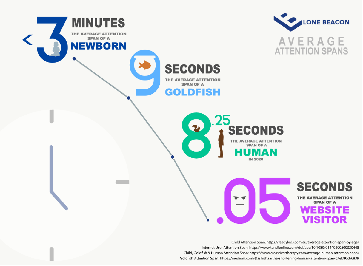
It takes about 50 milliseconds (ms) (that’s 0.05 seconds) for users to form an opinion about your website that determines whether they’ll stay or leave.
In today’s culture, we have put a sense of urgency on everything. From working in the office, sitting at dinner, or running on a treadmill at the same time as they are perusing your site, people are on the go. We multitask. And what we have found is that YOUR layout dictates the users’ route. Since most users are just skimming, we need to catch their eyes. Whether that’s by beautiful imagery, bold headlines or videos, the layout dictates where the eye moves. It’s second nature for the user. They don’t even think; the eyes just go.
Users Want to Feel in Control
Now, if we remember the last tip, “Useers Don’t Read. They Skim,” and we institute all the elements that we have learned to work best, then this one will take care of itself. The user always wants to be in control. Whether you push them in a certain direction or not. Think of it like a long line at Disney World. They constantly have you moving, headed for a destination. You feel like you’re in control as you walk through each twist and turn. As a matter of fact, it’s not until you are stopped, staring at the back of some stranger’s head with nowhere to go, that you realize Disney was dictating this trip all along.
Another real-world example is when you visit a news site. You begin to scroll when you’re hit with a pop-up that no longer allows you to control the webpage. I bet you will never visit that site again. So, make sure we not only know our user but also the intended path they need to take.
How Low Will They Go?
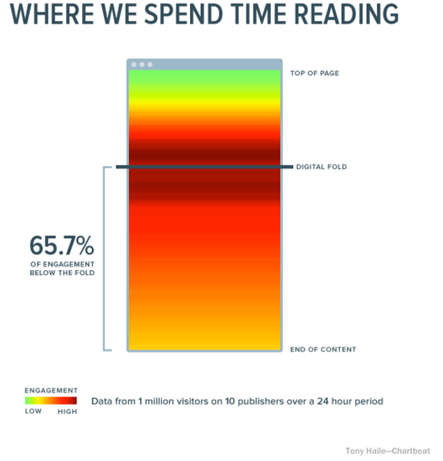
From all the data collected throughout the years on website users, people often think the right move is to cram as much information above the fold as possible. And while it’s important to get that information out there as quickly as you can, the main point is that you should aim for “the best” over “all the rest.” The top of your website, or “above the fold,” as they call it, is your elevator sales pitch. It’s 2022, and most, if not all, users know to scroll. It’s second nature, and they will happily do it.
Data collected from over a billion web visits shows that 66% of attention on a normal page is spent “below the fold.”

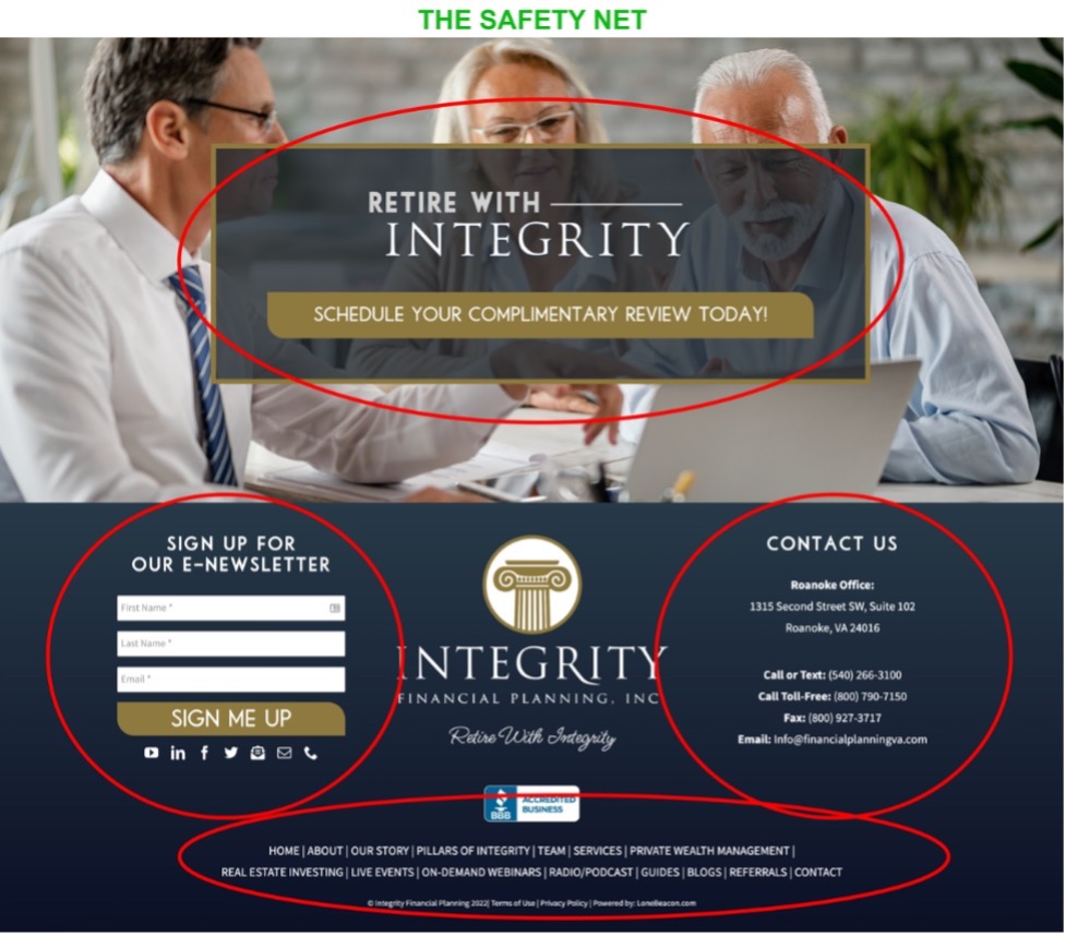
The user also knows that the in-depth information, next steps and call to action are typically found at the bottom of your page. I bet you didn’t know the bottom of your website is the second-most-viewed section. And it’s often the most overlooked by a designer. That’s why we like to serve multiple calls to action and contact information sections. We like to call this your “safety net.” It typically gives the user everything they may be looking for in a direct way, and it allows us to catch them before they disappear.
It’s Time for the Closer

Remember, your website is a journey. In 2014, my wife, Rebecca, and I went on a trip to Las Vegas. This was her very first time. As soon as we got downtown, she was hit with a major wave of anxiety and sensory overload! Everyone was competing for our attention, and they were giving us all they had, all at once. Some might say they were utilizing the “above the fold” landscape. But rather than draw us in to get our business, it made us retreat to the comfort of our boring, white-walled hotel room. We haven’t been back to Vegas since.
Of course, it’s important that you have a beautiful, fancy, flashy, state-of-the-art website, but take into consideration the end user first. There’s a reason why major companies such as SmartAsset, Dave Ramsey, Disney, Apple, and Calendly have their websites built the way they do, and it’s not because they can’t afford something more spectacular. It all comes down to knowing their end user and capitalizing on it. They understand the most effective journey that their user can take to eventually becoming a client.
Did You Know: Once on a company’s homepage, 64% of visitors want to see the company’s contact information, and 44% of website visitors will leave a company’s website if there’s no contact information or phone number.
Kirby Mack is vice president of digital media at Lone Beacon, a full-service marketing company dedicated to serving the financial industry.
[ad_2]
Source link

